Visual Hierarchy in Graphic Design
It begins simple enough. Design a page for a site to include information on ABC company, events, news, etc. This page can be done one of two ways: (1) Write all the information down very much like an informative letter or (2) section off each heading to make them standout, (image, heading, etc.) thus making it easier for a user to find what they need.
The above is visual hierarchy in graphic design. While both have the same information, how its displayed will determine if the page/site visitor leave immediately or stay to view more.
The number one goal of visual hierarchy is to communicate. How you organize, prioritize, and give highest importance to your page/site elements conveys valuable information about their relative importance. This hierarchy gives comprehension, message reinforcement, and helps to guide your visitor through your story.
What is Visual Hierarchy?
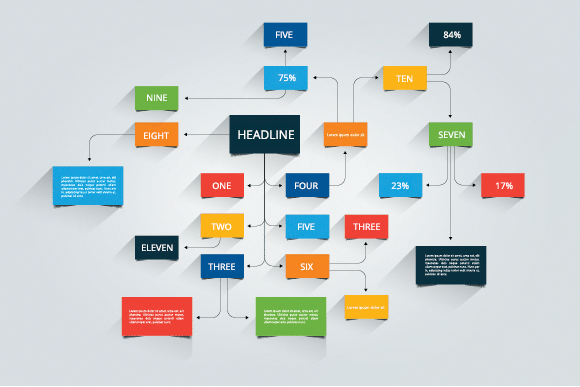
We know that a hierarchy is the organization of items into different levels of relative importance. Visual hierarchy is simply creating this organization and prioritization from a visual perspective.
Using basic design principles one element is emphasized over another so more important content visually looks more important. Visual clues are designed to support the hierarchy level you are promoting and organize all other elements on the page to create a sense of order.
In essence, you create a center of interest on each page, communicating meaning though continuity of image or style through repetition. This lends easily to highlight the actions you wish your visitors to take and will aid in your site designed patterns of movement and flow. Ultimately each page will contribute to the overall story each page contributes and blends with the site.
Why is it Important?
The importance is quite simple. We are visual beings. We understand images faster than words. Web pages and websites contain vast amounts of information to communicate. When we search and land on a page there is an immediate need to understand where the answers to our questions are without delay.
- Is my information here?
- Where is it on this page?
- How do I complete my task if it is not?
- Using visual hierarchies, designers enable easier page scanning and visually enforce specific headings, topics, information easier to understand. It can be described as clearing a path in the forest to see your destination directly.
Remember our page options earlier? One like a letter and another using images, headings etc.? To use the letter style, a user would need to do a lot of work to find their information, much less determine if the page itself is useful. The user will have no choice but to read every word to complete their task. The other option makes the page easier to scan. Each section is listed or highlighted so identifying the information required is done very quickly.
There is a purpose built-in to each page designed. Each page should have a goal. Sometimes it is simply to have the information read or the content will give your visitor a reason to enter a sales funnel. Every page designed should have a primary element you wish your visitors to notice.
How is it Important?
This process uses the basic principles of design to produce visually compelling layouts.
- Contrast
- Shows the relative importance.
- You instantly recognize that a larger text or heading has greater importance.
- Repetition
- Attaches meaning to new elements.
- The best example are the underlined blue links on a page. You've learned they symbolize a clickable link. Now each page you view they are instantly recognizable as a method to seek further information on a specific topic.
- Alignment
- This creates order.
- This process allows the visitor to quickly connect elements across a page, giving the visitor a start and end point to work from. It is probably best to think 'grids' here.
- Using alignment, we can bring a single element forward to call attention to itself. If you think of pull-quotes, this is an example of one effect. One line of text standing out in the middle of two paragraphs.
- Proximity
- The process of grouping elements together within a hierarchy to create sub-hierarchies.
- Your website home page offers a products, services, about us, contact us headings.
All above are controlled using the following design mechanisms.
- Size
- Color
- Density
- Value
- Whitespace
- Visually Specific - shape, prominence, images
Final Thoughts
Visual hierarchies give order to dis-order. By prioritizing, they offer clear communication. It is important to use qualified experienced professionals who will work with you on content and design.